In this tutorial, Angelica Choo Quan demonstrates how to create a DAX measure that helps occasional Power BI users identify what data points they have selected in visuals. The goal is to improve user understanding and make Power BI reports more intuitive, especially when filters or selections are applied across multiple visuals.
Problem Overview
Often, users viewing a Power BI report are unaware that selections made on one visual can affect the data shown in another visual, leading to confusion. For instance, when a user clicks on a specific item in a tree map, they may not realize that the results in a waterfall chart are filtered by that selection. While Power BI offers an Edit Interactions feature, the tutorial focuses on maintaining interactivity while clearly displaying selected values to users.
Step-by-Step Guide to Create the Measure
Angelica walks through the process of building a DAX measure to display selected data points clearly:
- Create a New Measure: Begin by creating a new measure to track selected values. This example uses a measure for the calendar year, but it can be adapted for other fields like distance group.
- Use the IF Function: The measure starts with an IF function that checks if there is a filter applied. If a filter is present, the measure will display the filtered values. If no filter is applied, it will show a message like "All Years".
- Implement the ISFILTERED Function: This function checks if a column has been filtered. If true, the selected values are shown; otherwise, all values are displayed.
- Use CONCATENATEX: The CONCATENATEX function is used to concatenate the selected values, making them appear as a single string. This function combines all selected items, separated by a comma, which is especially useful when multiple values are chosen.
Testing the Measure
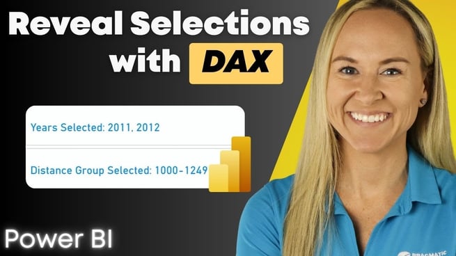
Once the measure is created, Angelica demonstrates how to test it by selecting a specific calendar year or distance group in the report. The selected values are dynamically displayed in a card visual, making it easy for the user to understand what filters have been applied.
Formatting the Visuals
Angelica also shows how to format the visual to make the selected values stand out. By adjusting font size and colors, users can create a more visually appealing and accessible report. Additionally, the visual layout can be changed from a row format to a single column to enhance readability.
Additional Recommendations
The tutorial also recommends using Power BI’s new card visual for better formatting options and emphasizes the importance of clear labels, such as “Distance Group Selected,” to avoid confusion.
Conclusion
This DAX measure is an effective way to guide occasional users through Power BI reports, helping them understand which filters and selections are active. By using this approach, users can keep the interactivity of the visuals while ensuring that the data presented is clear and easy to interpret.
If you found this tip helpful, be sure to check out Pragmatic Works' on-demand learning platform, which offers additional Power BI courses to help you master visual storytelling and design.
Don't forget to check out the Pragmatic Works' on-demand learning platform for more insightful content and training sessions on DAX and other Microsoft applications. Be sure to subscribe to the Pragmatic Works YouTube channel to stay up-to-date on the latest tips and tricks.








-1.png)
Leave a comment