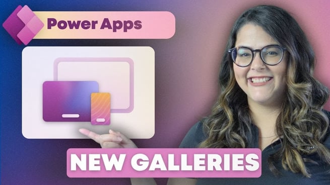
Power Apps is a powerful tool for creating custom apps without requiring a lot of coding knowledge. One of the most valuable features in Power Apps is the ability to create responsive apps that scale seamlessly across different screen sizes. In this video, Helen Devlin, a Power Platform trainer at Pragmatic Works, shares quick tips for building responsive galleries that adjust dynamically to screen size, ensuring a smooth user experience on various devices.
What is Responsive Style in Power Apps?
- Responsive Style: In previous versions of Power Apps, developers had to manually build apps that responded to different screen sizes. Now, Power Apps includes a new responsive style to make it easier for developers to create apps that automatically adjust based on screen dimensions.
- Screen Templates: Helen recommends starting with Power Apps’ pre-built screen templates, which come with controls that help your app scale properly across different devices, such as phones and tablets.
Step-by-Step Guide to Building a Responsive Gallery
Helen explains how to set up a flexible gallery that will adapt its layout based on the screen size. Below are the steps she demonstrates in the video:
- Choosing the Right Screen Format: Power Apps allows you to choose between Phone and Tablet formats for apps, with the newly introduced Responsive style being an excellent option. Starting with a screen template can make the scaling process easier, as it includes controls designed for responsiveness.
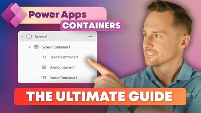
- Setting Up the Containers: Helen explains the importance of using containers for a responsive layout. Containers, both vertical and horizontal, are essential for ensuring the controls scale and adapt to different screen sizes. Vertical containers are used to align elements top-to-bottom, and horizontal containers are used for side-by-side arrangements.
- Adding and Configuring the Gallery: The first step is to add a Flexible Height Gallery to your main container. This type of gallery is the best option for ensuring your content scales correctly. After inserting the gallery, Helen suggests selecting the data you want to display and setting up your template.
- Using Containers in the Template Cell: Inside the gallery’s template cell, add a vertical container. This container will house your text or other controls. Make sure the width of the container is tied to the template width of the gallery. This ensures the container scales properly when the gallery adjusts to different screen sizes.
- Styling the Content: Helen demonstrates how to style the text within the container. She starts by adjusting the font size and enabling auto-height to make the text stretch within the container. Conditional formatting is used to adjust the font size based on the screen size. For example, on smaller screens (like phones), the font size automatically decreases to fit within the screen.
- Adjusting the Layout for Small Screens: One important trick is to set a conditional font size based on screen dimensions. For example, if the width of the app is smaller than its height (i.e., on a phone), the font size adjusts accordingly to avoid scrolling. Using the formula
If(app.width < app.height, 12, 36), Helen ensures that the text fits nicely on mobile screens without causing scrollbars.
- Finalizing the Gallery Setup: After configuring the first text label, Helen duplicates it within the vertical container to add more data. She also adds gaps between the elements and padding around the edges to improve the visual appearance and spacing.
Conditional Logic for Responsive Design
One of the most powerful tools in building responsive apps is conditional logic. Helen explains that this logic allows you to adjust various properties, such as font size or layout, based on screen size. For example, the font size of text in the gallery changes dynamically depending on the app's width.
    Example Formula for Conditional Logic:
    If(app.width < app.height, 12, 24) – Adjusts font size based on screen width.
Best Practices for Building Responsive Galleries
- Use Containers: Both vertical and horizontal containers are essential for ensuring a responsive design.
- Start with Templates: Power Apps templates come pre-configured with controls for easy scaling.
- Conditional Formatting: Always use conditional logic to adjust fonts, spacing, and other properties based on screen size.
Helen’s Final Thoughts
Helen concludes by discussing the new responsive option in Power Apps, which simplifies the process of making apps more adaptable to various devices. Previously, developers had to create responsive apps manually by stitching together different components. Now, with Power Apps’ built-in features, developers can easily create apps that automatically scale, improving user experience across devices.
If you're interested in learning more about creating responsive canvas apps, Pragmatic Works offers on-demand courses for all levels of expertise. Helen encourages viewers to check out their more in-depth resources on building responsive Power Apps.
Don't forget to check out the Pragmatic Works' on-demand learning platform for more insightful content and training sessions on Power Apps and other Microsoft applications. Be sure to subscribe to the Pragmatic Works YouTube channel to stay up-to-date on the latest tips and tricks.




![Microsoft Teams: Building Your First Power App [Building Power Apps In Microsoft Teams – Ep. 1]](https://pragmaticworks.com/hs-fs/hubfs/maxresdefault-Nov-24-2025-08-25-02-2859-PM.jpg?width=406&name=maxresdefault-Nov-24-2025-08-25-02-2859-PM.jpg)


-1.png)
Leave a comment