
 Datazen is a reporting tool recently acquired by Microsoft that allows dashboard creation and publishing based on many data sources, including Excel. With Microsoft's acquisition comes many questions about the Datazen interface. In this post, Ginger Grant will give you insight on creating Datazen dashboards.
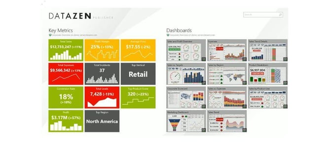
Dashboard creation in Datazen uses the Publisher application. My previous post walks through installing it in detail. When you open the Datazen Publisher Application, you will notice that it has a mobile interface, not a Windows interface, which means using it can be different from what you may expect. To create a dashboard, you will need to click the menu on the bottom on the screen. If there is no menu bar on the screen, right click anywhere and the menu bar will appear. There are two options available for you when you get started, either and empty dashboard or an existing dashboard, which provides a design template as shown on the picture of the screen.
Setting Up Excel as Data Source in Datazen
Your data can come locally from Excel or from the Datazen server. I picked Excel. The navigation is not the Windows-like navigation I am used to, as I had to click on the libraries to get a drop down menu to get to my data. The first spreadsheet I selected contained a Power Pivot Data Model. Datazen doesn’t appear to read Power Pivot Data Models, as it was unable to access the data. First I needed to modify my excel spreadsheet to create a flat pivot, and then Datazen can use that as a source. After I modified my Excel spreadsheet, then I was able to use that spreadsheet as a source in DataZen. Then I tried to create some KPIs. I found out that Excel cannot be used as a data source for KPIs in Datazen unless you configure Datazen Server to use excel like a SQL Server Data source. Good to know, and hopefully you will read this before you decide to use Excel as a data source, which will save time.
About Datazen Visualizations
After all of your data sources are defined, it’s pretty easy to set up visualizations from the selections on the left. One thing that I really like about the Designer is the snap-to-grid function, which makes laying out content much more organized. I wish other dashboard design tools I use had a grid. When visualizations are selected, the settings for configuring it are on the bottom of the screen. The output can be designed for a phone or a tablet from the master view. This feature makes a lot of sense as the screen size changes the way the display looks and your ability to click on it. The maps are pretty nice out of the box. Here’s a time-saving tip when creating maps in Datazen. Make sure that you spell out the state names when you want to use them. The visualizations you create will allow you to drill into other reports, similar to other reporting applications. It’s not really meant to be self-service BI, but a tool to present dashboards to business users and provide them the level of detail desired by creating deeper dive other reports. As it was designed for a mobile environment, touching the screen to interact with the visualizations means needing to think about finger size when creating phone applications so that interaction is possible by all users.
Try Datazen Yourself
I hope you found this post useful and take the time to explore the product yourself. I am sure Microsoft has a lot of plans for Datazen, one of which is backward compatibility. Datazen now has a preview of the Publisher in Windows 7, along with the released product in Windows 8, which will allow more people to use it. If you are exploring dashboarding tools, especially for a mobile deployment, this could be the tool you end up selecting.


-1.png)
Leave a comment