In this module, you will learn how to use the Power KPI Custom Visual. The Power KPI displays your KPI indicator values on a helpful multi-line chart with labels.
Module 61 – Power KPI
Downloads
Key Takeaways
- Shows KPI values across a multi-line chart.
- Highly customizable with many properties that can be configured.

This Power KPI displays the actual, prior year actual and budget values on a simple chart with KPI indicators on top.
- Under the Format paintbrush there are many sections available to modify the appearance of this visual.
- Under the Layout section, you can adjust both the auto layout and auto scaling that are turned on by default with this chart. Turning auto layout off, for example, will allow you to manually select how the labels are visualized on the chart.

- The Title and Subtitle properties allow you to customize and chart titles displayed on your visual.


- Under the KPI Indicator section, you can customize the type and color of the indicator used in the chart. You have KPI 1, KPI 2, KPI 3, KPI 4, and KPI 5 that can be used here. The values of 1-5 are related to the field you provide in the KPI Indicator Index.

- The next set of properties: KPI Indicator Value, KPI Indicator Label, Second KPI Indicator Value, Second KPI Indicator Label, KPI Actual Value, KPI Actual Label, KPI Date Value, and KPI Date Label are all very similar to each other. These sections allow you to adjust the formatting used in the values and labels that appear in the section above the chart.

- Under the Data Colors section, you can adjust the colors that are used on the lines in the chart.

- By default, the Data Labels section is turned off. By turning this on, your chart will have data labels which allow you to adjust the formatting and density of labels.

- Using the Line Style section, you can adjust the style of the lines that are used in the chart.

- The Line Thickness properties allow you to control the thickness of each individual line on your chart.

- Adjusting the Legend section allows you to move the legend or change the formatting displayed in the legend.

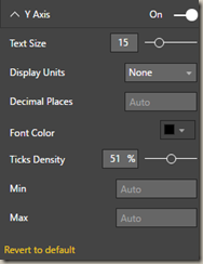
- Under the X Axis and Y Axis properties, you can adjust the appearance of the labels shown both vertically and horizontally on the chart.


- The X Axis and Y Axis Reference Lines can be used to adjust the reference lines that appear vertically and horizontally on the chart.


The next set of properties-- Tooltip Label, Tooltip KPI Indicator Value, Second Tooltip KPI Indicator, and Tooltip Values --all have to do with the formatting of the tooltip that appears or pop-up when you hover above the chart values.
In addition to these properties, there are settings that appear on every visual to adjust the background color, add a border around the visual and lock the aspect ratio.
Find Out More
You will always be able to find this video module and advanced viewing of future modules on the Pragmatic Works On-Demand Training platform or view my previous blog posts.


.png?height=100&name=Devin_pic%20(1).png)


-1.png)
Leave a comment