<img height="1" width="1" style="display:none" src="https://www.facebook.com/tr?id=612681139262614&amp;ev=PageView&amp;noscript=1">
Skip to content

Need help? Talk to an expert: phone(904) 638-5743

Power BI Custom Visuals -Stacked Bar Chart by Akvelon

Power BI Custom Visuals -Stacked Bar Chart by Akvelon

Power-BI-Banner.jpg

In this module you will learn how to use the Stacked Bar Chart by Akvelon. This version of the Stacked Bar Chart sets itself apart because of the selection rectangle that allows you to highlight specific regions of the chart to filter other parts of your report.

Module 118 – Stacked Bar Chart by Akvelon

Downloads

Key Takeaways

  • Similar to the native bar chart but includes a selection rectangle.
  • This allows you to select a specific cluster of values.

image

This Bar Chart shows total sales by region and month.

Under the Format paintbrush you will find there are several customizations that you can enable for this visual.

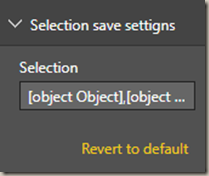
  • Under the Selection save settings you don’t necessarily need to make any changes, but this records what values are selected in the chart.

image

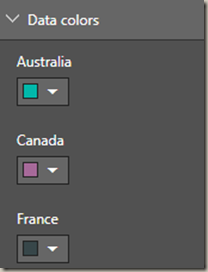
  • Under the Data colors section you can change the colors used for each series in the chart.

image

  • Using the Legend properties you can change the appearance and location of the legend on the chart.

image

  • Changing the Y-Axis section allows you to modify the appearance of the Y-Axis section of this chart.

image

  • Changing the X-Axis section allows you to modify the appearance of the X-Axis section of this chart.

image

You can also adjust the background color, add a border around the visual and lock the aspect ratio under the Format section.

Find Out More

You will always be able to find this video module and advanced viewing of future modules on the Pragmatic Works On-Demand Training platform or view my previous blog posts.


Sign-up now and get instant access

Leave a comment

Free Trial

On-demand learning

Most Recent

private training

Hackathons, enterprise training, virtual monitoring