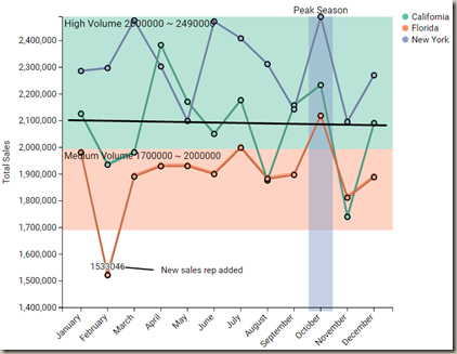
In this module, you will learn how to use the ChartAccent -LineChart Custom Visual. This visual is a custom line chart that allows you to annotate individual data points, data series and ranges.
Module 83 – ChartAccent – LineChart
Downloads
Key Takeaways
- Has the ability to highlight individual data points, data series and ranges.

This ChartAccent – LineChart shows sales for California, Florida and New York with annotations on key areas of the data.
Under the Format paintbrush, you will find there are no specific settings that can be adjusted for this visual.
- In the Y Axis section, you can change the Y Axis title and adjust the Start and End of the Y Axis.

You can also adjust the background color, add a border around the visual and lock the aspect ratio under the Format section.
Find Out More
You will always be able to find this video module and advanced viewing of future modules on the Pragmatic Works On-Demand Training platform or view my previous blog posts.


.png?height=100&name=Devin_pic%20(1).png)


-1.png)
Leave a comment